What UX designers in Fintech need to consider in 2024.

Imagine a thrilling voyage where money meets technology, steering the course toward uncharted territories. That’s where Fintech UX design sets sail, weaving innovation into the fabric of our financial future. It’s a journey with personalized experiences, talking interfaces, and mind-bending augmented reality.
Today, we’re not just bystanders; we’re intrepid explorers delving into the heart of Fintech to uncover the top 5 trends shaping the way we interact with the captivating blend of money and technology.
How Fintech Differs From Orthodox Financial Service Companies
What makes fintechs different from traditional or old-school banks and financial companies?
Well, back in the day, those traditional financial services had super boring, confusing, and kind of scary websites and apps. They had menus that felt like mazes, weird economic words that made no sense, and not-so-friendly customer service.
But now, modern fintechs are changing the game.
They’re way better than the old guys in three big ways: It’s way easier to get started with them, they give you better service, and their apps and websites are a breeze to use.
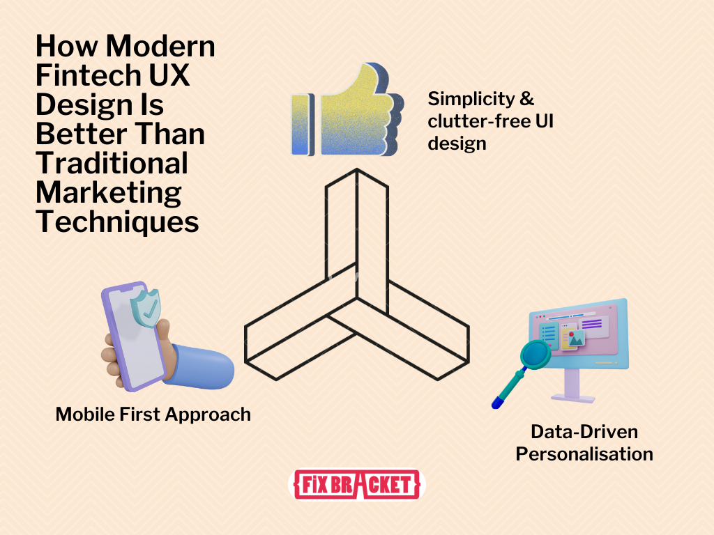
Here are three ways in which Fintech UX Design differs from traditional marketing standards:

Simplicity and Clutter-Free Design:
Fintech UX design focuses on minimalism and simplicity, aiming to reduce clutter and provide a seamless user experience. Modern FinTech apps and websites present users with clean interfaces, intuitive navigation, and a limited number of well-organized options.
This is in stark contrast to traditional digital marketing, where the focus was often on bombarding users with information and advertising. A cluttered design can overwhelm users and hinder their ability to perform financial tasks efficiently. Data from usability studies conducted by Nielsen Norman Group indicates that users strongly prefer clean and simple designs.
A study on website usability found that participants consistently rated simpler, less cluttered designs as more visually appealing and easier to use. Fintechs have embraced these findings and applied them to their platforms to create a better user experience, resulting in higher user engagement and satisfaction.
Mobile-First Approach:
Fintech UX design places a strong emphasis on mobile devices, recognizing the importance of smartphones in users’ lives. Fintech apps are typically designed with a mobile-first approach, ensuring that they function seamlessly on various mobile devices, including smartphones and tablets. This approach is in contrast to the traditional digital marketing standards, where websites were often designed primarily for desktop computers. According to data from Statista, mobile internet usage has consistently risen, with over half of all global web traffic originating from mobile devices. Fintechs have capitalized on this trend by optimizing their user interfaces for mobile, making it convenient for users to manage their finances on the go. This shift in focus has contributed to the success of many fintech apps.
Data-Driven Personalization:
Modern fintech UX design leverages advanced technologies, such as artificial intelligence (AI) and data analytics, to provide highly personalized experiences. Fintech apps analyze user data to offer tailored recommendations, alerts, and insights, enhancing the user’s financial journey. This is a significant departure from traditional digital marketing, which often relied on static, one-size-fits-all content and ads. Data from Accenture shows that 81% of consumers want their financial institutions to understand their individual needs and offer them relevant solutions. Fintechs achieve this through AI-powered personalization, which has been proven to increase user engagement and satisfaction. According to Evergage, 88% of marketers reported a measurable lift in business results due to personalization efforts.
In summary, modern fintech UX design sets itself apart from traditional digital marketing standards by prioritizing simplicity, adopting a mobile-first approach, and employing data-driven personalization. These technical approaches are supported by data indicating user preferences and the effectiveness of these design strategies, contributing to the growing success of fintech companies in the financial industry.
Top 5 Fintech UX Design Trends
In the thrilling journey where finance meets technology, UX has ascended as the sovereign. Think of UX as the compass guiding every interaction between users and financial technology. It’s not just about pretty interfaces; it’s about crafting experiences that are intuitive, seamless, and user-centric.
In the world of Fintech UX Design, where every transaction and decision affects the user, the significance of UX cannot be overstated. So, ready your sails and join this voyage through uncharted Fintech waters!
1. Mobile-First Banking
Mobile-first banking is all about making your financial services super accessible through smartphones. These days, lots of fintechs and neobanks don’t even have physical branches – it’s all in the palm of your hand.
So, what’s crucial for these fintechs is to give users an awesome experience. It’s not just about being functional; it’s about being super easy to use, intuitive, and offering a whole bunch of stuff in one app.
Now, what’s cool is that fintechs are making their apps even more powerful by teaming up with other services. They’re like Swiss Army knives for your finances and more. You can connect them to crypto exchanges, and stock trading platforms, pay your bills, book your travel, and even handle your social stuff all in one place.
But here’s the technical part: Mobile-first means designing your app with a focus on mobile devices. It involves optimizing the user interface and experience for small screens, touch interactions, and limited processing power. Fintechs need to make sure their apps work flawlessly on various smartphones.
These integrations with third-party services involve complex application programming interfaces (APIs) and data exchange protocols.
Fintech companies need to ensure secure and smooth data transfer between their app and these external services. They also have to handle authentication and data synchronization to provide users with a seamless and secure experience.
This approach essentially turns fintech apps into ecosystems, where users can seamlessly manage various aspects of their lives, from finances to leisure, all within one app. It’s a win-win, simplifying users’ lives while keeping them engaged and loyal to the fintech brand.
2. Data Visualization Tools For Fintech UX Design

Data Visualization for Fintech UX Design
Fintech companies can gain a significant edge by harnessing the power of data visualization on their mobile apps and websites.
Imagine this: you log into your banking app, and instead of rows of bland numbers, you’re greeted with colorful, interactive charts and graphs displaying your financial health at a glance.
Here’s how they do it:
- Real-time Insights: Fintechs can use data visualization to present real-time data about your spending, savings, and investments. These visual elements make it easy for users to understand complex financial information quickly. For instance, a pie chart can show how your expenses are distributed, and a line graph can reveal the growth of your investments over time.
- Interactive Dashboards: Fintech apps can offer customizable dashboards where users can drag and drop different widgets to track their preferred financial metrics. These widgets can include things like spending trends, investment performance, and even budgeting progress. It’s like tailoring your financial cockpit for a smooth ride.
- Risk Assessment: Visualizing risk is crucial for investors. Fintechs can use heatmaps or risk matrices to display the potential risks and rewards associated with various investment options. This helps users make informed decisions and manage their portfolios effectively.
- Transaction Analysis: When it comes to individual transactions, data visualization can help users spot irregularities or anomalies in their spending patterns. For instance, a scatter plot can highlight unusual spending spikes, potentially indicating fraud or overspending.
- Cryptocurrency Trends: For fintechs offering crypto services, visualizing the volatile world of cryptocurrencies is a game-changer. Candlestick charts or price heatmaps can provide users with valuable insights into the crypto market’s behavior, helping them make smarter investment choices.
Incorporating data visualization tools into fintech apps and websites not only enhances user experience but also empowers users to make more informed financial decisions. It’s like having a personal financial advisor right in your pocket or on your computer screen.
3. Augmented Reality (AR) and Virtual Reality (VR): Immersive Financial Experiences

Step into the fascinating world of augmented reality (AR) and virtual reality (VR), where the boundaries between the physical and digital realms blur. AR and VR technologies are poised to revolutionize fintech UX design by providing immersive and interactive financial experiences.
Imagine putting on a VR headset and stepping into a virtual investment portfolio, where you can visualize and interact with your assets in a three-dimensional space. With VR, users can gain a deeper understanding of their investments, explore market trends in a visually captivating manner, and even simulate investment scenarios to make more informed decisions.
On the other hand, AR overlays digital information onto the real world, creating a blended experience.
This means you can use AR glasses or your smartphone to view real-time financial data overlaid on physical objects. Imagine walking down the street and seeing stock prices floating above storefronts or viewing your account balance as a holographic display on your coffee table.
AR and VR technologies also have the potential to enhance financial education and literacy. Interactive tutorials, simulations, and virtual classrooms can provide engaging and immersive learning experiences, making complex financial concepts more accessible and understandable.
Examples of AR and VR in Fintech UX Design
Leading fintech companies are already exploring the possibilities of AR and VR in their platforms.
For example, investment firms are developing VR applications that allow users to explore virtual investment portfolios and visualize the potential impact of different investment strategies.
AR is being used to enhance the in-branch banking experience, where customers can use their smartphones to scan and receive additional information about products and services.
Some insurance companies are also leveraging AR to provide virtual property tours for underwriting purposes. The integration of AR and VR in Fintech UX design opens up a world of opportunities for creating engaging, immersive, and educational financial experiences that go beyond traditional interfaces
4. Omnichannel Consistency and Integration: Seamlessly Connected Finance
In today’s digital landscape, users expect a seamless and consistent experience across various devices and platforms. Fintech companies are embracing the concept of omnichannel design, which ensures that user experiences remain connected and cohesive, regardless of the device or channel used. This provides a seamless fintech UX design.
The omnichannel design allows users to start a transaction on one device and seamlessly continue it on another without any disruptions.
For example, you can initiate a fund transfer on your smartphone and complete the process on your laptop or tablet without losing any information or progress.
Examples of Omnichannel Consistency and Integration in Fintech UX Design
Leading banks and financial institutions are adopting omnichannel approaches to enhance user experiences. They provide mobile apps, responsive websites, and even smartwatch applications that offer consistent functionality and access to financial services.
With omnichannel integration, users can seamlessly switch between devices and channels while accessing their account information, conducting transactions, and receiving notifications.
For instance, you might receive a notification on your smartphone about a recent transaction and then review the details on your tablet or computer.
The omnichannel design ensures that finance is not limited to a specific device or channel, providing users with the flexibility and convenience to manage their finances on their terms.
5. Gamification: Creating An Engaging Fintech UX Design
Imagine if managing your finances felt more like playing a game than a chore. Gamification is a fintech UX design concept that leverages game elements and mechanics to enhance user engagement and motivation. In the world of fintech, gamification is revolutionizing the way we approach financial management.
By incorporating game-like features such as challenges, achievements, leaderboards, and rewards, fintech platforms are transforming the traditionally mundane tasks of budgeting, saving, and investing into exciting and interactive experiences.
Users can earn points, badges, or virtual currency for meeting financial goals, making wise financial decisions, or completing financial education modules.
Gamification not only makes finance more enjoyable but also encourages positive financial behaviors. Users are motivated to save more, make informed investment choices, and develop healthy spending habits to unlock rewards and progress in the game.
Furthermore, gamification fosters a sense of community and healthy competition. Users can compete with friends, family, or other users, comparing their financial achievements and cheering each other on. This social aspect adds an extra layer of fun and motivation to the financial journey.
Examples of Gamification in Fintech UX Design
Many fintech platforms have embraced gamification to enhance user engagement. Budgeting apps may incorporate challenges or quests that encourage users to stick to their budgeting goals and earn rewards for meeting targets.
Investment platforms may introduce virtual portfolios where users can practice investing with virtual money and compete with others to achieve the best returns. This can be a terrific boost for your fintech UX design strategy.
Additionally, some banking apps offer cashback rewards or loyalty programs where users can earn points for specific transactions or achieve higher status levels based on their financial activity.
Gamification in fintech UX design injects an element of excitement and motivation into financial management, transforming it into an engaging and rewarding experience.
Wrapping Up: What’s The Future For Fintech UX Design?
The future of fintech UX design is filled with innovative design concepts that redefine how we interact with financial technology.
From personalized experiences that cater to individual needs to voice-enabled interfaces, augmented reality, and omnichannel integration, these cutting-edge concepts are reshaping the landscape of finance.
So, get ready to embrace the future of fintech UX design—a world where innovation and user-centric design converge to create an intuitive, secure, and engaging financial experience. The possibilities are limitless, and the journey is just beginning.
People Also Read:
How To Build A Career In UX Design?
Google Analytics 4: Why UX Designers Should Leverage It.


